


The brief I gave myself was one line. If we can draw it, we have to be able to build it.

The new homepage, as designed on the canvas.
That's why our new website runs on Wix Headless. We designed every page on one big canvas and built the pages in code with Astro. Wix still runs everything behind them: the CMS, the blog, bookings and forms. The site has two calculators, a brief builder that talks back, a live booking diary and one set of animation rules across every page. On a phone, the homepage scores 99 for performance in Lighthouse.
This is how we built it, what went wrong, and what we changed to get the speed.
TL;DR
Our new site runs on Wix Headless. The pages are written in code with Astro, and Wix still runs the CMS, blog, bookings and forms behind them.
Every page was designed on one canvas first: 275 artboards, with a wireframe, an SEO pack and a database map behind the designs.
The site has a website cost calculator, an SEO ROI calculator, a chat-style brief builder, a live booking diary and one motion system.
The first build scored 64 for mobile performance. After a speed pass, the homepage scored 96, then 99 on the live domain. We didn't cut a feature to get there.
Headless isn't for every business. For most sites, Wix Studio is still the better choice.
Why we moved our own site to Wix Headless
Wix Headless splits a website in two. Wix keeps running the back office: the dashboard, the CMS, the blog, bookings, forms and payments. The pages people see are written in code and talk to Wix through its APIs. Wix-managed headless projects are built on Astro, and Wix hosts the lot.
I'd already built our proposal tool on Wix Headless, with client comments landing in the Wix CMS. Our own website was the obvious next step. If we're going to recommend headless to clients, our site should be the proof.
I also wanted things an editor makes hard. Calculators that change as you type. A brief builder that asks one question at a time. A booking diary with live slots. Animation on every page, not just the homepage. And full control over speed, structured data and the HTML that Google and AI search read first.
Now when we became a Wix content leaders and we're ahead of the launch of Wix Studio 2, I felt that our website needed a good redesign and some great functionality, following our own advice.
Our Wix Headless page goes through when it's worth it in more detail.
Every page started on one canvas
Before anyone wrote code, the whole site lived on one design canvas in Claude. By launch it held 275 artboards across eight pages, including the designs, the wireframes, a database map and a library of designed parts.
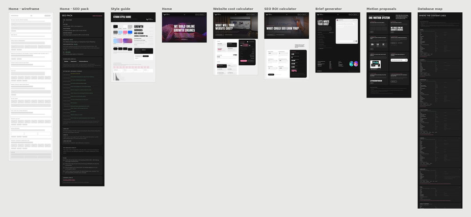
A few of the 275 artboards behind the new site, from the home wireframe to the database map.
Most pages have a desktop board at 1280 pixels wide and phone boards at 390, so we saw both before anything was built. A small status light sits above each page. Red means it needs work, yellow is preview only, and green is ready to push to the live site.
We started with real content, not lorem ipsum. Every page of the old site, its Search Console data, our reviews and all 195 blog posts were gathered before the design started. Real copy changes the design, so it's cheaper to know it up front.
Real copy changes the design, so it's cheaper to know it up front.
A wireframe and an SEO pack for every page
Each page has a grey wireframe and an SEO pack beside it. The pack holds the title, meta description, H1, keyword, schema and an alt text map for every image. Each keyword belongs to one page only, decided before any copy was written, so our own pages don't compete with each other.
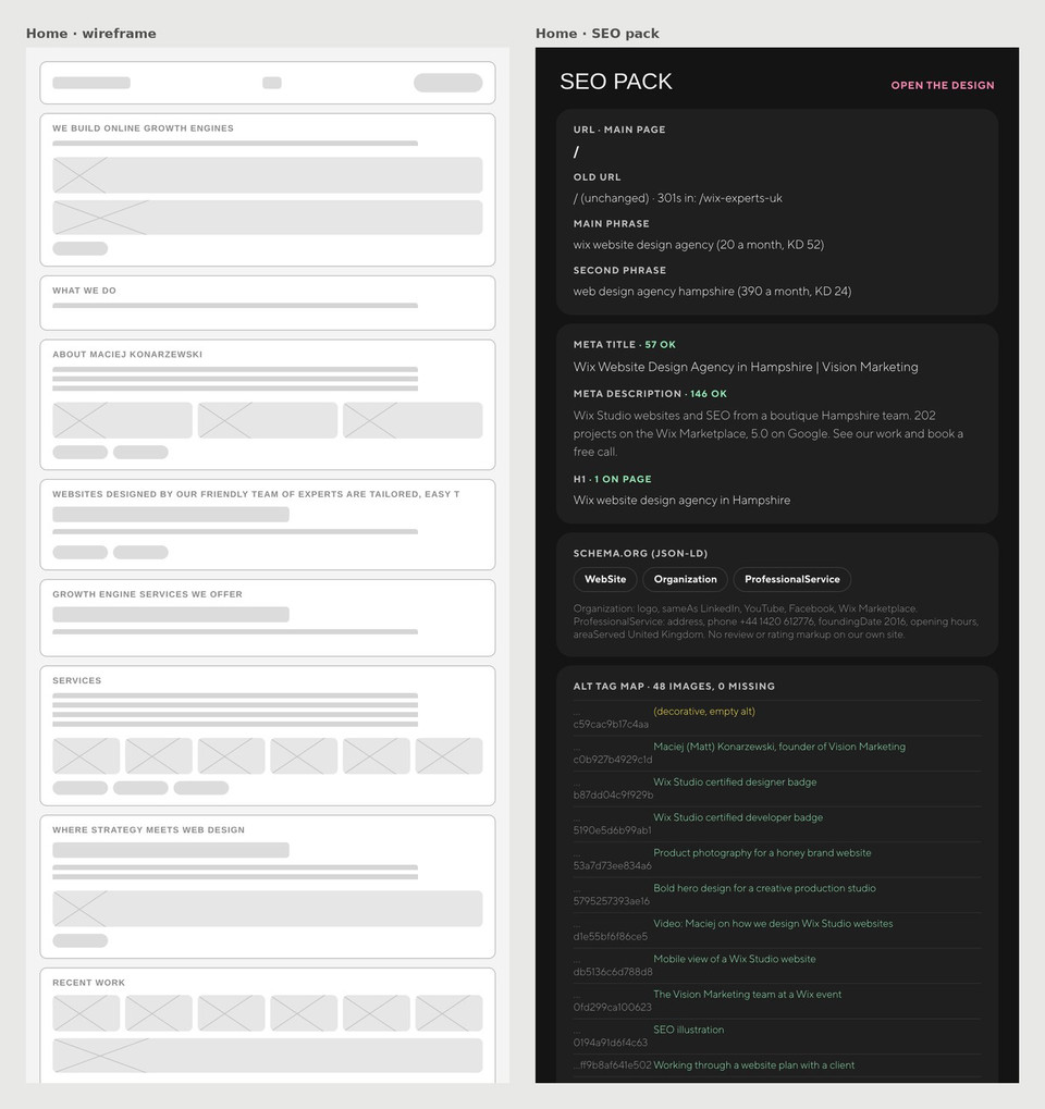
The home page wireframe and its SEO pack, side by side on the canvas.
A map of where the content lives
The database map shows every Wix CMS collection, its fields, and which pages read it. That covers team, clients, portfolio, case studies, videos, services, FAQs, reviews, and the blog. When a design changes, its wireframe and SEO pack change with it. When a field changes, the map does too.

The database map board, starting with the Team collection.
One style guide and a library of parts
The style guide sets the type (Anton for headlines, TT Norms Pro for everything else), the colours, corners, spacing and a 12-column grid. Every new element got its own library board before it went onto a page. There are 47 of them, from buttons to the reviews carousel. The header, menu and footer are shared parts, so a change in one place shows on every page.

The style guide board: colours, type, buttons and the grid.
From the canvas to code
Once a page was signed off on the canvas, it was turned into an Astro page. Live Wix data went into the slots where the canvas showed example content, and the interactions were rewritten as plain scripts.
I built it with Claude writing most of the code, and I made the calls. Wix lists Claude Code among the AI tools that connect to Wix Headless, so this is the setup Wix expects people to use.
The content stays in Wix. Blog posts, reviews, FAQs, team bios, and videos all live in the Wix CMS and the Wix Blog. We still edit them in the dashboard, like any other Wix site.
We built on a preview while the old site stayed live. Wix lets you build the new front end and check it before you move your domain across. You can switch back if you need to. Wix's guide to moving a site to a custom frontend covers how it works. It's the same idea as redesigning a Wix site without downtime, taken a step further.
Before the switch, every old URL was mapped to one new address. The blog moved from /wix-blog to /blog, so every post needed its own redirect.
Features a template couldn't give us
This is where "if we can draw it, we can build it" mattered most. Each of these runs on the live site today.
A website cost calculator
The website cost calculator answers the first question nearly everyone asks. You pick a platform (Wix Classic, Wix Studio or Wix Headless), drag the page count and tick the features you need. Then you choose who writes the copy, the level of SEO, your business size and languages. The estimate updates as you go, there's a VAT switch, and the project steps underneath change to match your picks.
It's there to help people plan. Every project still gets a fixed price after a free call.

The website cost calculator. Prices are blurred here, and the live page shows them.
An SEO ROI calculator
The SEO ROI calculator works in pounds. You put in monthly searches, click-through rate, conversion rate, order value, margin and what you'd spend on SEO. It shows the visits, sales, revenue, profit and return on investment that adds up to. It starts with a made-up example and explains where to find your own numbers.

The SEO ROI calculator, with the made-up example numbers it starts with.
A brief builder that talks back
Some people aren't ready for a call. The brief builder asks 22 questions in seven sections, one at a time, like a chat. Answers stay in the browser until you press send. Where the browser supports it, you can talk instead of typing. The finished brief goes into Wix Forms, so we can quote from a real brief.

The brief builder asking its first question.
A live booking diary
The booking page and the contact page pull free slots straight from Wix Bookings. You pick a website call with me or an SEO call with Anna, then a day on the calendar. The free times show in UK time.
Reviews and videos, built from the CMS
Wix lists its Reviews app and Wix Video among the apps that don't work on headless yet. Our reviews page is built from a CMS collection holding our Google and Wix Marketplace reviews, with tabs by source and chips by theme. The video library works the same way, from a CMS collection with format and topic filters.
For us, the unsupported apps list meant building our own version with the CMS.
Custom animation with one set of rules
The homepage has four big scroll effects: a fluid hero, pinned services, a video mosaic and a drifting project gallery. Once those were in, the inner pages felt flat next to it, and hover timings were different from page to page.
So we wrote one motion system for the whole site. One easing curve. 250 milliseconds for colour, 450 for movement, and one second for images and reveals.
Sections fade up 12 pixels as they arrive, and stats count up to the real figure. Buttons nudge, FAQ answers slide open instead of jumping, and the footer spells out LET THE GROWTH BEGIN one letter at a time. If you have reduce motion switched on, the scroll and text animations switch off and the content shows straight away.

The motion system board. Each card has a Replay button so we could try the effect before it went live.
How we got the Lighthouse scores
Our first build scored 64 for mobile performance on the homepage. It loaded 27.6 MB, and the largest image took 25 seconds to appear on a phone. Lots of video and full-size images will do that.
We didn't cut a single feature to fix it. We changed how things load:
Videos wait until they're near the screen, and the homepage video starts once the page has loaded.
Every big image got a WebP copy. The founder photo went from 1.6 MB to 70 KB, and phones get smaller versions of the big images.
Fonts are self-hosted and cut down to Latin and Polish characters, from 83 KB to 33 KB per weight. Matched fallback fonts stopped text jumping as the fonts load, which took layout shift to zero.
YouTube videos show a thumbnail and only load the player when you click. That saved about 960 KB on the About page.
Media files are cached for a year.
After that pass, the homepage scored 96 on mobile on the preview site, with 100 for accessibility, best practices and SEO. On the live domain on 29 October it scored 99. The About page scored 96, the blog 97 and a blog post 98.

Mobile performance for the homepage, from Google's PageSpeed Insights.
We didn't cut a single feature to get the speed. We changed how things load.
By then, the biggest drag on speed was two scripts in the site's custom code. They blocked every page for about two seconds on a phone. If your Wix site feels slow, look at the custom code in your site settings before anything else.
Scores move a few points between runs, mostly because third-party scripts load at different speeds. You can run the same test on any site with PageSpeed Insights, which uses Lighthouse.
What went wrong
Four things caught us out. I'd warn any agency about each of them.
A release took the site to a 404 for 32 minutes. We'd shipped a release with the source code attached. Now we release the build only, then load a few real pages and check their titles straight after.
Old redirects fought the new pages. The old site's redirect rules were still there after the switch. Some looped against the new site's own redirects. About and Blog were the usual culprits. Now we audit every old redirect before switching.
Main pages had two titles. Wix serves the title and meta description for main pages from the dashboard. Our code added its own as well. Wix's developer docs say to let the dashboard own those tags. Next time we'll do that from day one.
UK phone numbers bounced. The phone field in Wix Forms wouldn't take numbers starting with 0. The form now converts them to +44 before it sends.
Each of these is now a line in the checklist we use for client headless builds.
Should your business go headless?
Probably not, and I say that having just moved our own site. For most businesses, Wix Studio is the better choice. Your team can edit layouts visually, it's quicker to build, and it's easier to hand over. Our Wix Studio page covers it.
Headless is worth it when two or more of these are true:
Search and AI visibility are the main goal, and you want full control of the code, speed and structured data.
The design or the user flow can't be built well in an editor.
A website and an app, or several sites, need to share one store or booking system.
The site has to talk to your other systems, like a CRM or custom pricing.
Check three things before you decide. Layout changes become a developer job, because the pages are code. Some Wix apps don't work on headless yet, and Wix keeps the list. And if you need a second language, Wix's developer docs say secondary-language versions of main pages don't get their own title or meta description yet.
If you're weighing up headless or Wix Studio for your own site, book a free call and we'll tell you which fits. If you'd rather not talk yet, write us a brief or get a rough figure from the calculator. All three were built for the site this post is about.
Frequently asked questions
What is Wix Headless?
Wix Headless lets you build a website's pages in code while Wix runs the business side through its APIs. That covers the CMS, blog, bookings, store, members, forms, and payments. Wix-managed headless projects are built on Astro and hosted by Wix. You keep the Wix dashboard, and the front end is yours.
Can you still edit a Wix Headless site in the dashboard?
Content, yes. Blog posts, CMS items, bookings and form submissions all stay in the Wix dashboard. Page layouts are code, so layout changes go to a developer.
Is Wix Headless good for SEO?
It can be, if it's built properly. With Astro on Wix hosting, main pages take their SEO tags, sitemap and robots.txt from the dashboard settings. Blog posts and CMS pages need their SEO wired in code. Our homepage scores 100 for SEO in Lighthouse on mobile.
How long did your rebuild take?
The rebuild ran from 19 to 28 October 2026, from the first artboards to switching the domain over. [Matt: add a line on what kept it quick, if you want one.]
Which Wix apps don't work with Wix Headless?
Wix keeps the list in its Help Center. At the time of writing, it includes Pro Gallery, Wix Video, the Reviews app, Groups, Loyalty Program, Online Programs and Smart Chat. Stores, Bookings, the Blog, the CMS, Forms, Events and Pricing Plans all work.


